Making buying plats more enjoying
Plantrum - a plant store. Retail. Web. Projector institute. 2025
Plantrum is a cozy plant store offering a full range of services: from landscaping and care to transplants and accessories.
1.5 month
Role
User Research, Prototyping, Visual design, Interaction, Testing
Team
Vitalii D., Andrii T., Olga Y., Yuliia M., Larysa K., Anya M.
The problem
This brand was so pleasant to communicate with. We saw how they spread care and love in their plant business. We even bought some new plants for our homes.
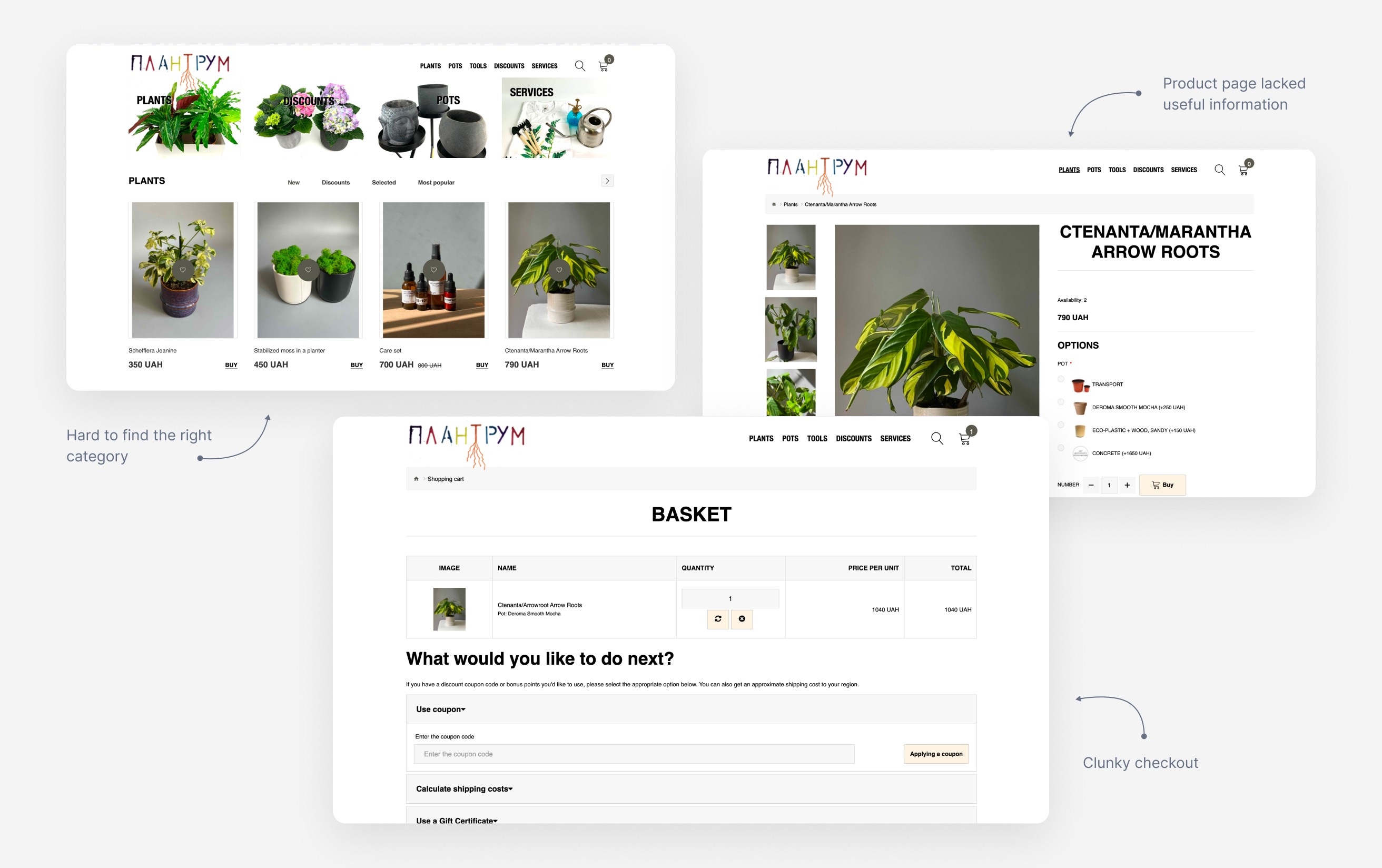
The thing was that their website was too way outdated and didn’t reflect the soul of their brand. In addition it had a poor purchasing experience, inconvenient checkout flow, lack of plant care information, and an outdated visual design.
We were tasked to conduct user research to identify pain points and redesign the website to create a smoother, more intuitive purchasing experience.
Research
We ran in-depth user interviews to really get to know our customers — their needs, motivations, and habits. We looked at how people browse and choose plants or services, what drives their decisions, and what kind of help they expect, especially when it comes to care and maintenance.
So we started by (turning ourselves into a plants) gathering qualitative data to help us understand customers’ motivation and pain points.
We were focused on two main groups: individual customers with varying levels of plant care experience and businesses interested in interior landscaping solutions.
Key findings
Most customers buy plants to make their spaces feel more cozy and alive.
They prioritize aesthetic appeal first, then look for easy care.
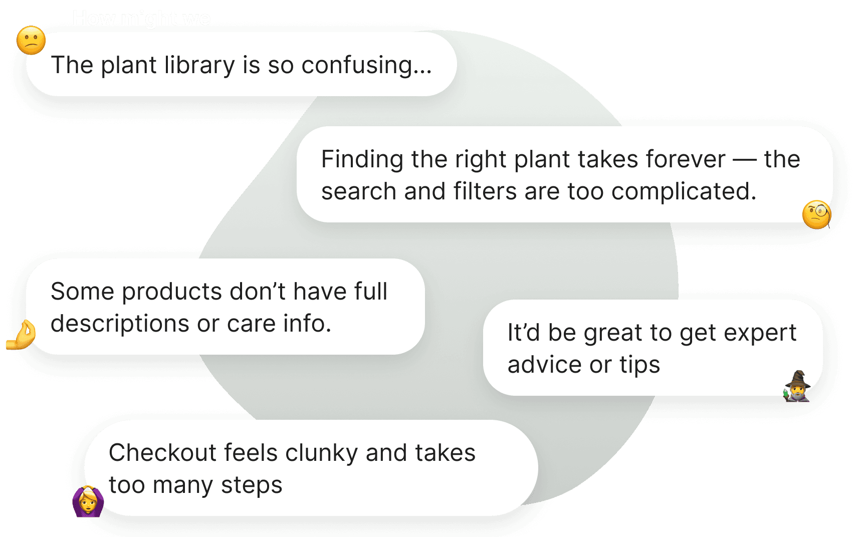
Users struggled to find care instructions for specific plants.
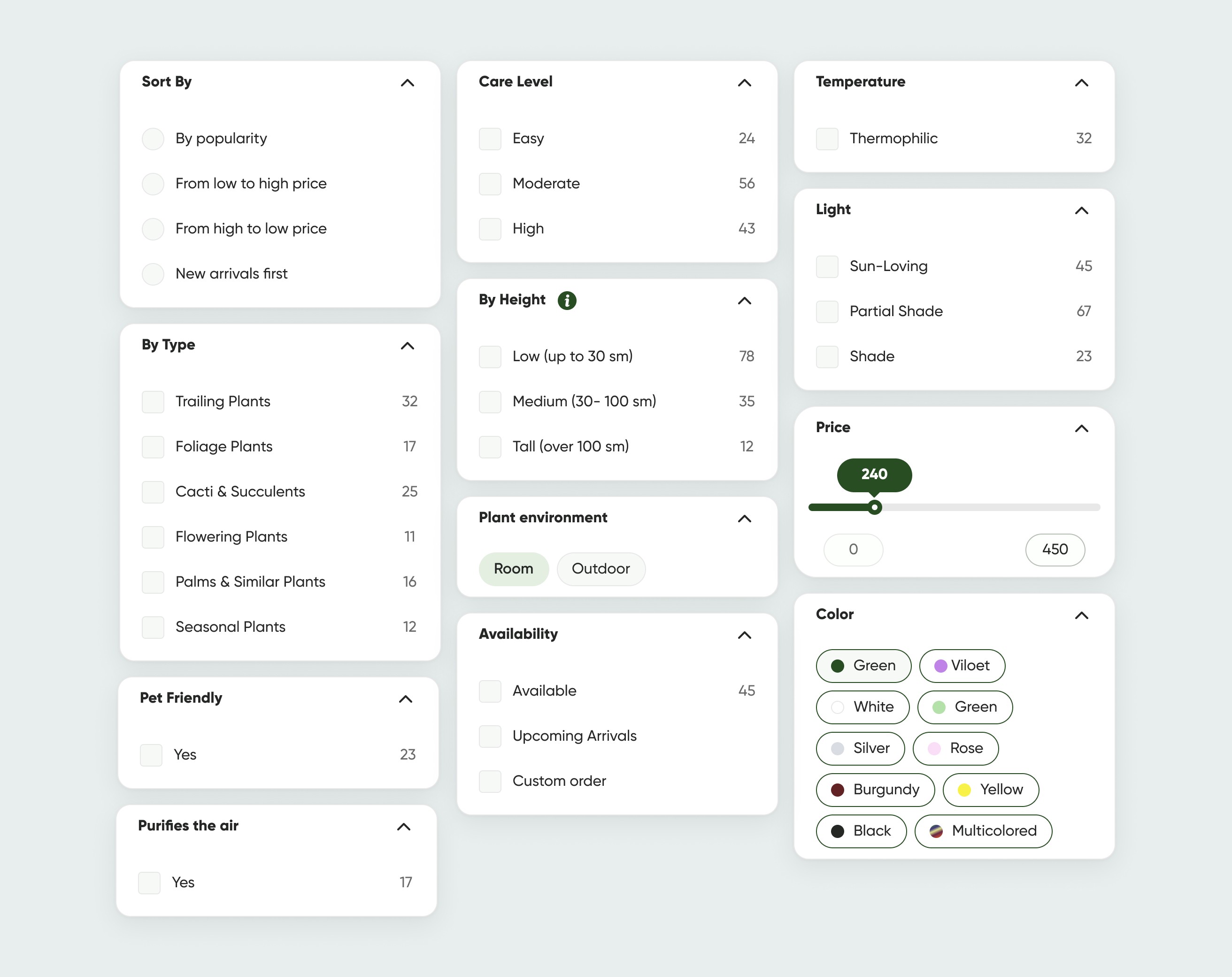
Filters weren’t helpful in narrowing choices — for example, finding pet-friendly, non-toxic plants wasn’t intuitive.
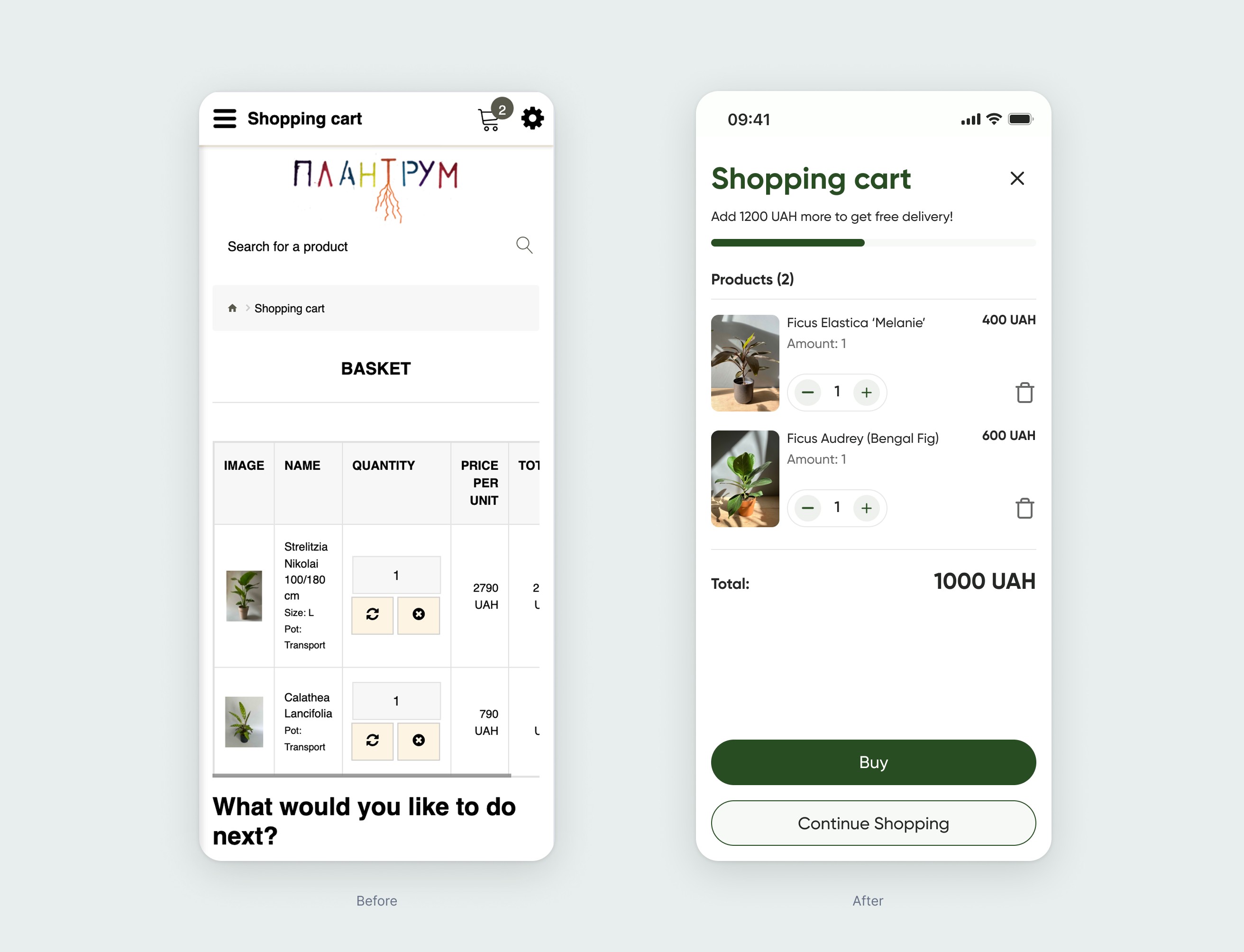
The checkout form was too long and discouraging, making it hard to complete purchases.
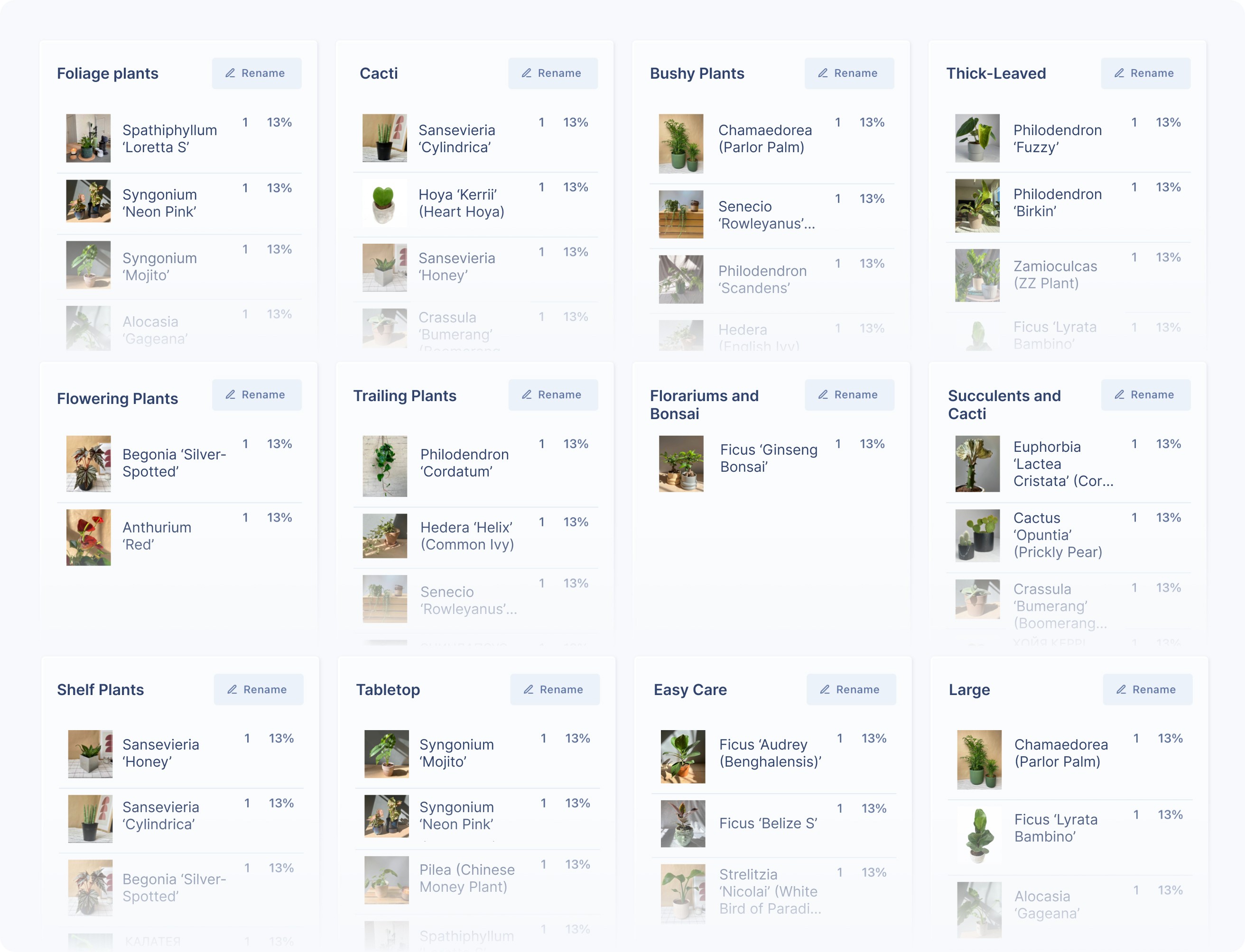
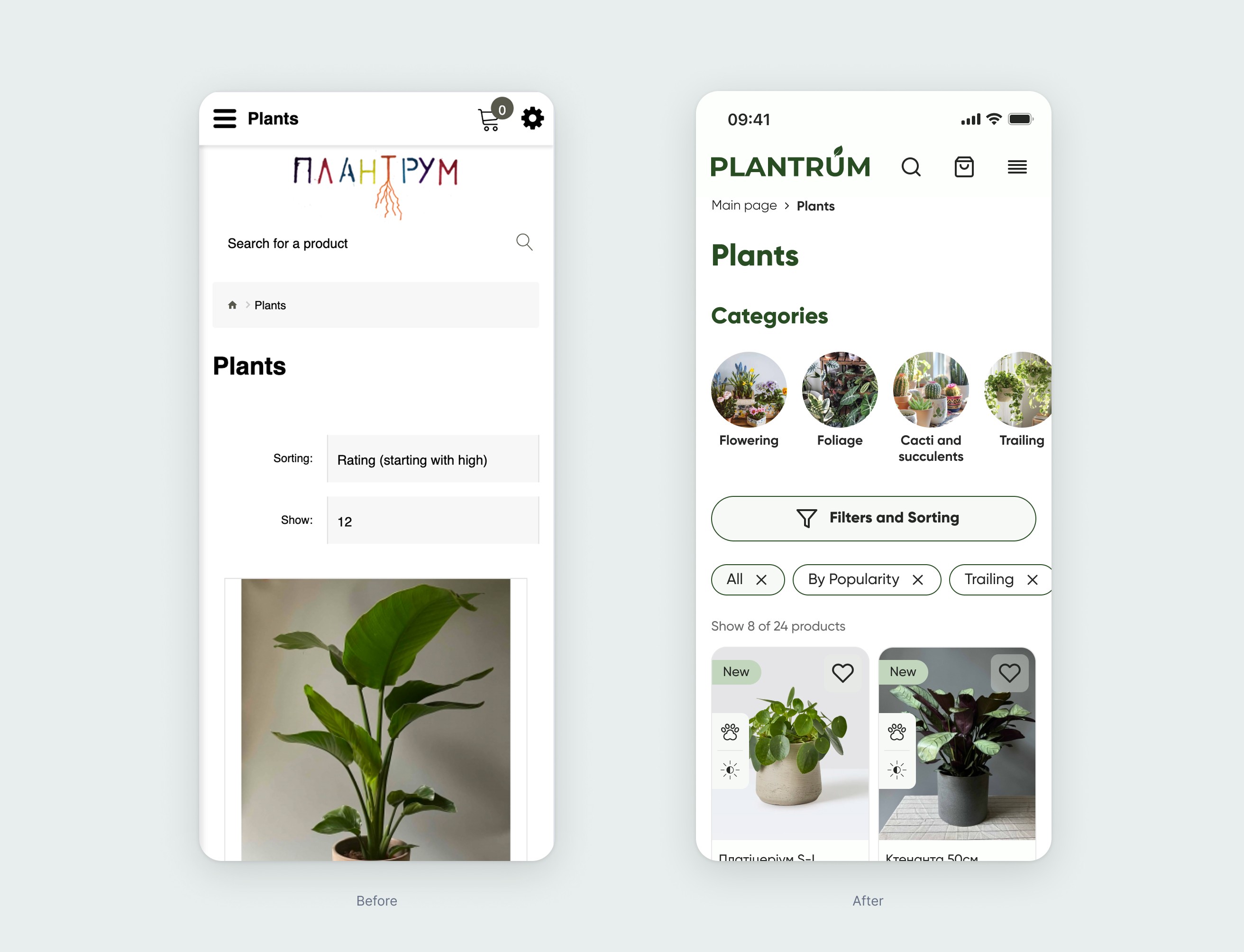
Working with categories
We get the feedback from users that it was difficult to navigate the Plantrum online store when browsing through categories. So we ran a card sorting exercise to get to the root of the problem. We gave people cards with plant photos and names, and asked them to group them however made sense to them — and to name the groups themselves.
Watching them sort was super insightful. Some grouped by care level, others by plant size or even where they'd place them at home. It helped us understand how people naturally expect to see plants organized — and how their plant knowledge influenced the way they think about categories.
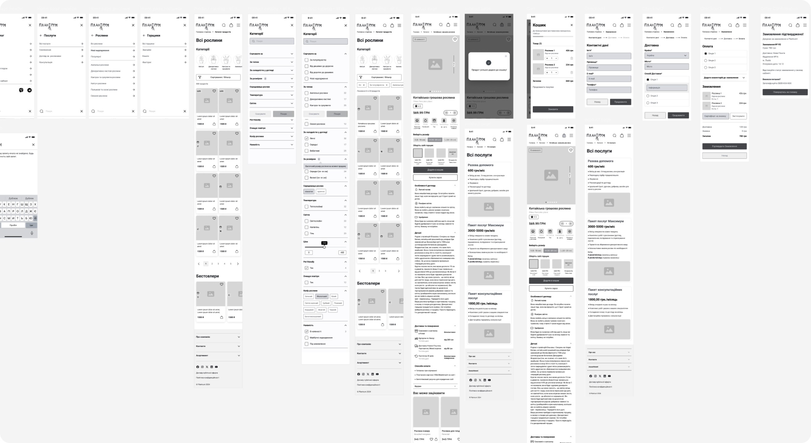
Based on our research, we created greyscale wireframes to outline the structure and functionality of the product. This helped us make it easier to throw away the designs that weren’t working, try again, and also get feedback from stakeholders before finalizing the designs.
We started from mobile because according to the data this ’s the main channel where the customers do the most purchases.
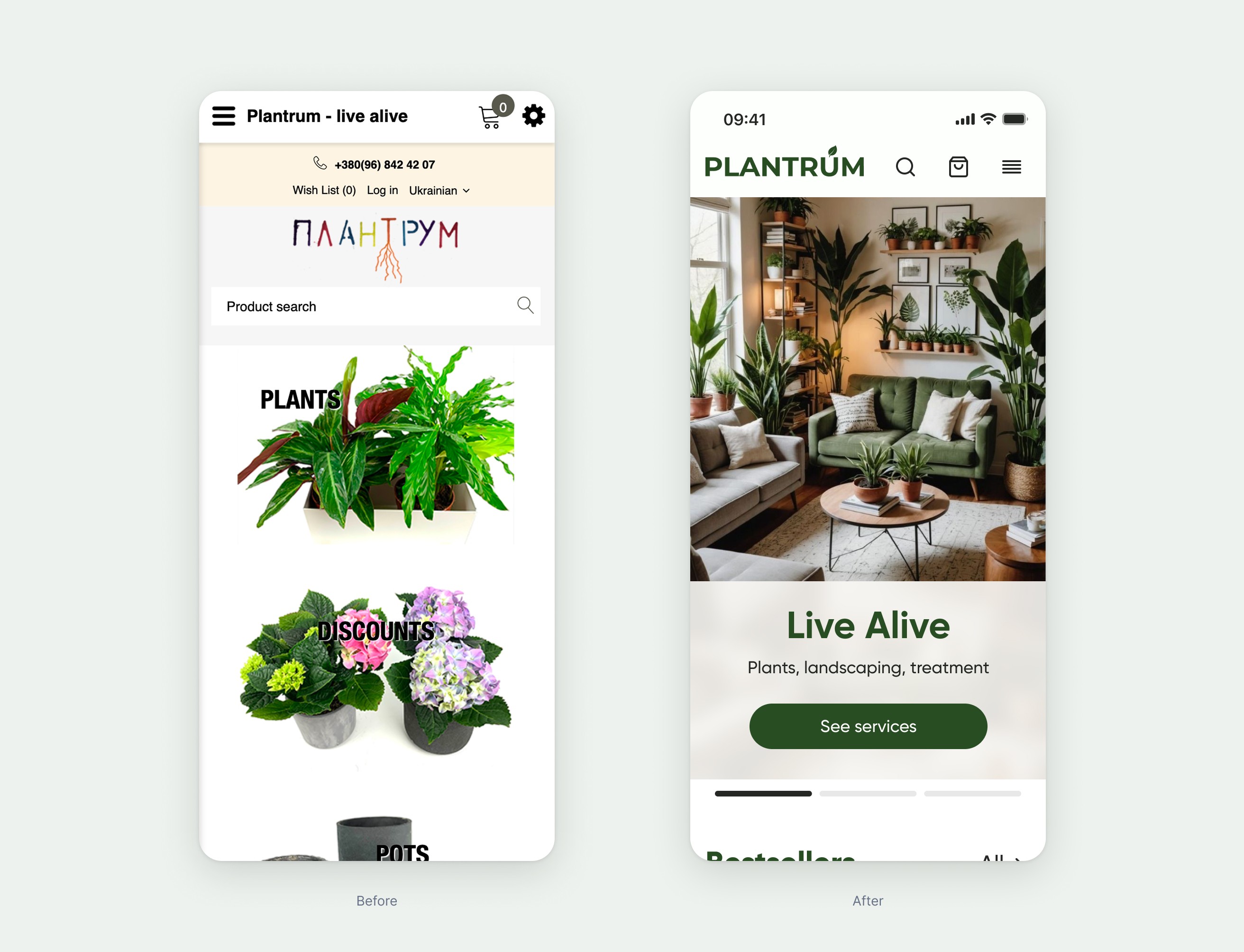
Visual design
The visual style we created uses a calm, natural color palette that reflects the store’s vibe and aligns nicely with their existing social media design.
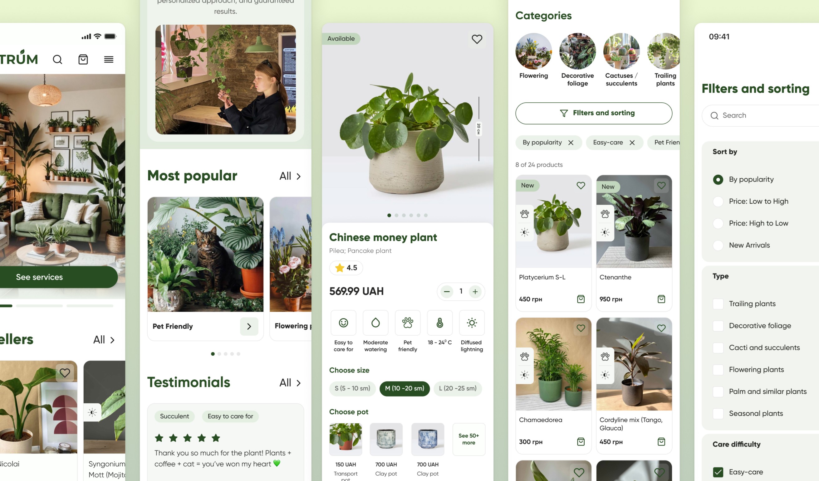
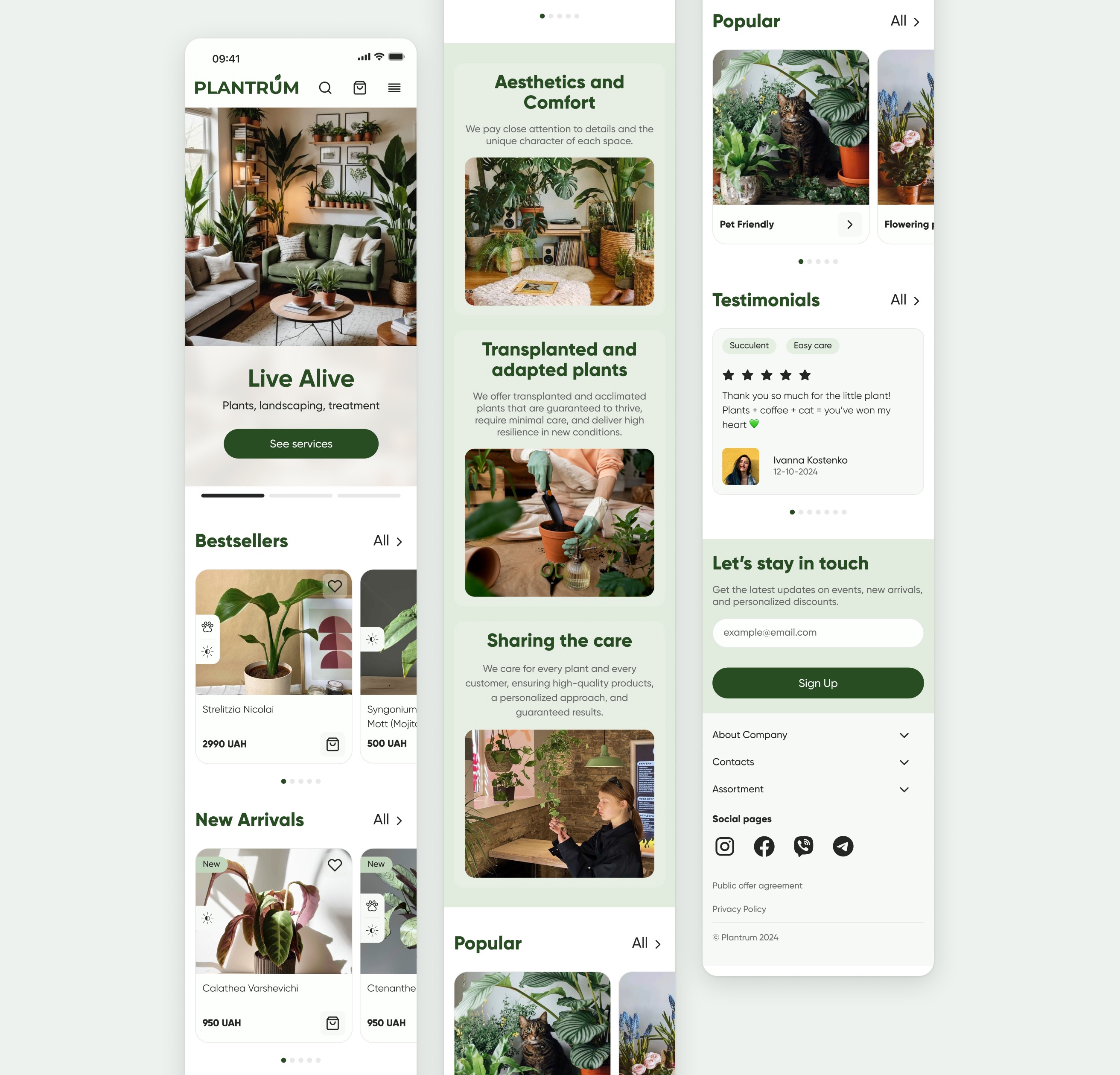
Now, the homepage welcomes users with only the most essential info about the brand, highlights starting-point categories to help them explore easily, and features key benefits and testimonials.
We also reworked the product pages, filters, categories, and checkout flow based on insights we gathered during user interviews.
Lack of detailed information about services
The main issue was that users didn’t really trust the site when they first landed on the homepage. To fix this, we highlighted the business’s strengths—added sections for perks, customer reviews, ratings, and the most popular categories. We also added a quick chat widget so users can easily reach out to consultants.
Another problem was that your services weren’t very visible. We solved this by showing a list of services right on the homepage and adding a “Services” section in the product menu. This way, users quickly see that you offer more than just plants and can access all the info they need right away.
Improving filters
During the interviews, the biggest issue users mentioned was the lack of product filtering and clear, easy-to-understand categories. After realizing that users name categories in different ways we make the labels more user friendly and more flexible options to set up filters.
All the filter categories are based on how users mentally organize them. As a user, I want to find a small plant that is non-toxic to my cat and easy to care for, because it’s just to make my home cozy. With the new filters, it’s much easier now to meet this kind of request.
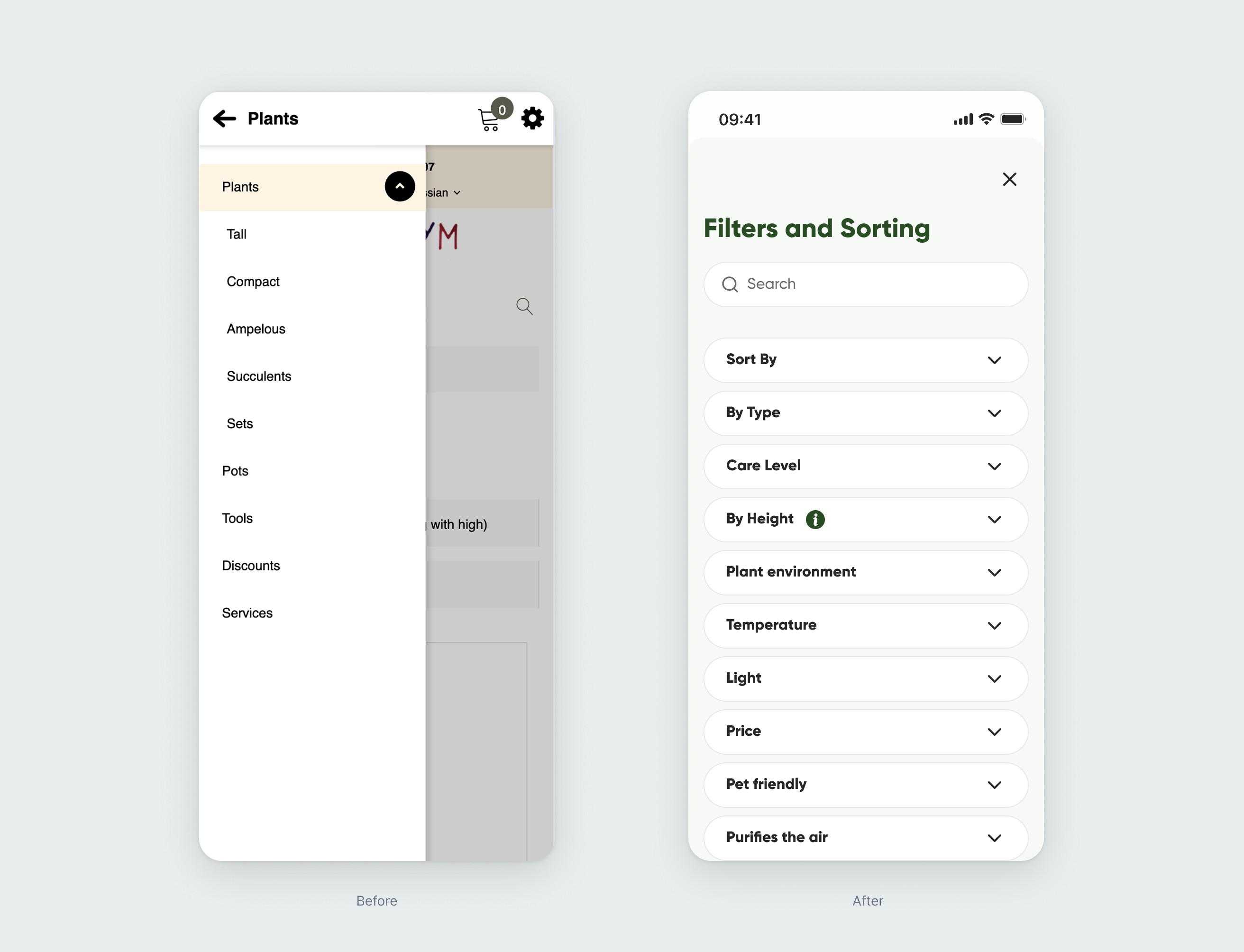
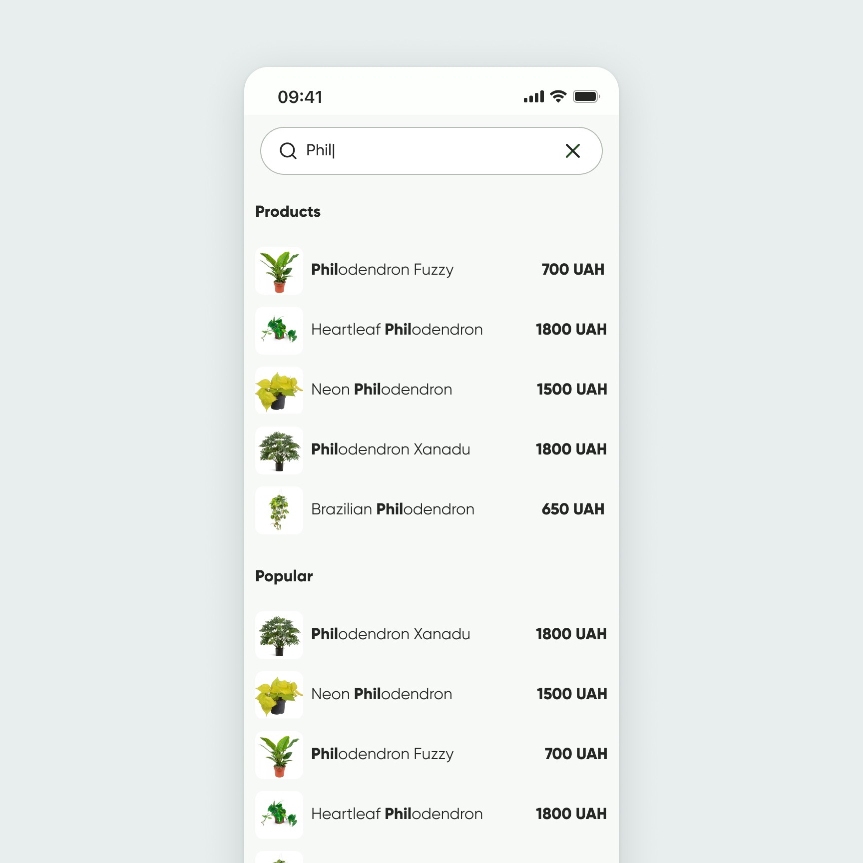
We also improved the search, so it now suggests products to users as soon as they start typing. This makes finding the right plant much faster and more convenient.
Lack of detailed information about plants and products
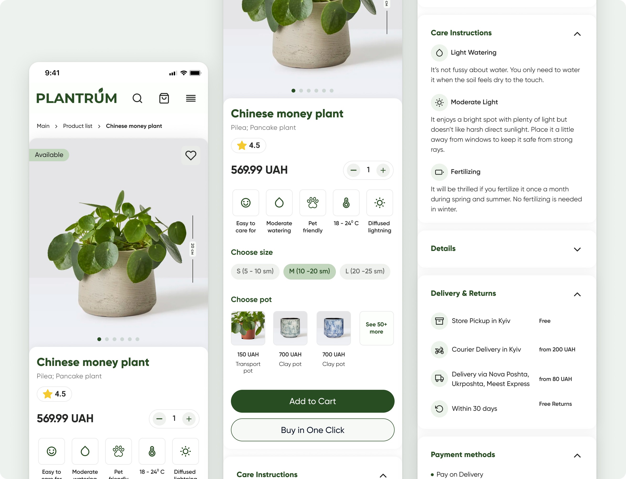
There was no clear information about plant parameters and care. Users also couldn’t tell the actual size of the plants, which made it hard to decide which one would fit their space. However, the store always provides an informative card with brief care instructions for purchased plants. We decided to apply this same pattern on the product page as well.
We added clear size indicators for each plant, included informative tags on the product cards, and visually highlighted key care features. This way, users can quickly understand the plant’s size and care requirements, making it easier to choose the right plant for their home.
We added clear size indicators for each plant, included informative tags on the product cards, and visually highlighted key care features. This way, users can quickly understand the plant’s size and care requirements, making it easier to choose the right plant for their home.
Checkout
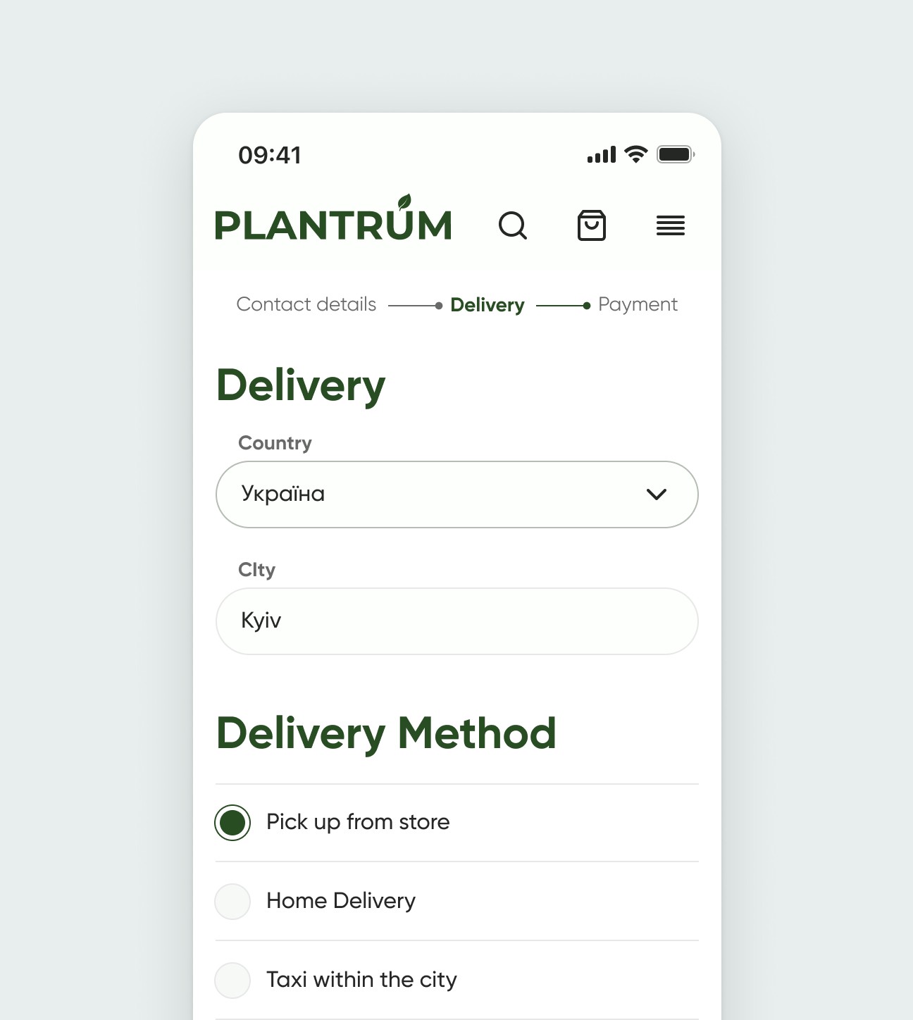
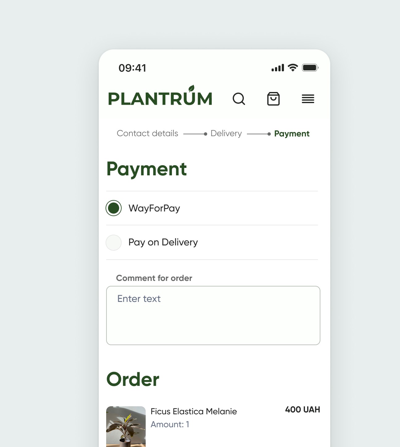
To make the checkout process smoother and more enjoyable, we broke the long form into three easy steps.
Takeways
Working on Plantrum case study taught us that people don’t just buy plants — they connect with them emotionally. I learned how important it is to keep things simple when users are overwhelmed by choice. Even something like adding clearer filters or making plant care easier to understand can make a big difference.
This project also reminded me how helpful real user feedback is — it grounded our ideas and made the final solution way more useful and friendly.